


Overview
Freelance design
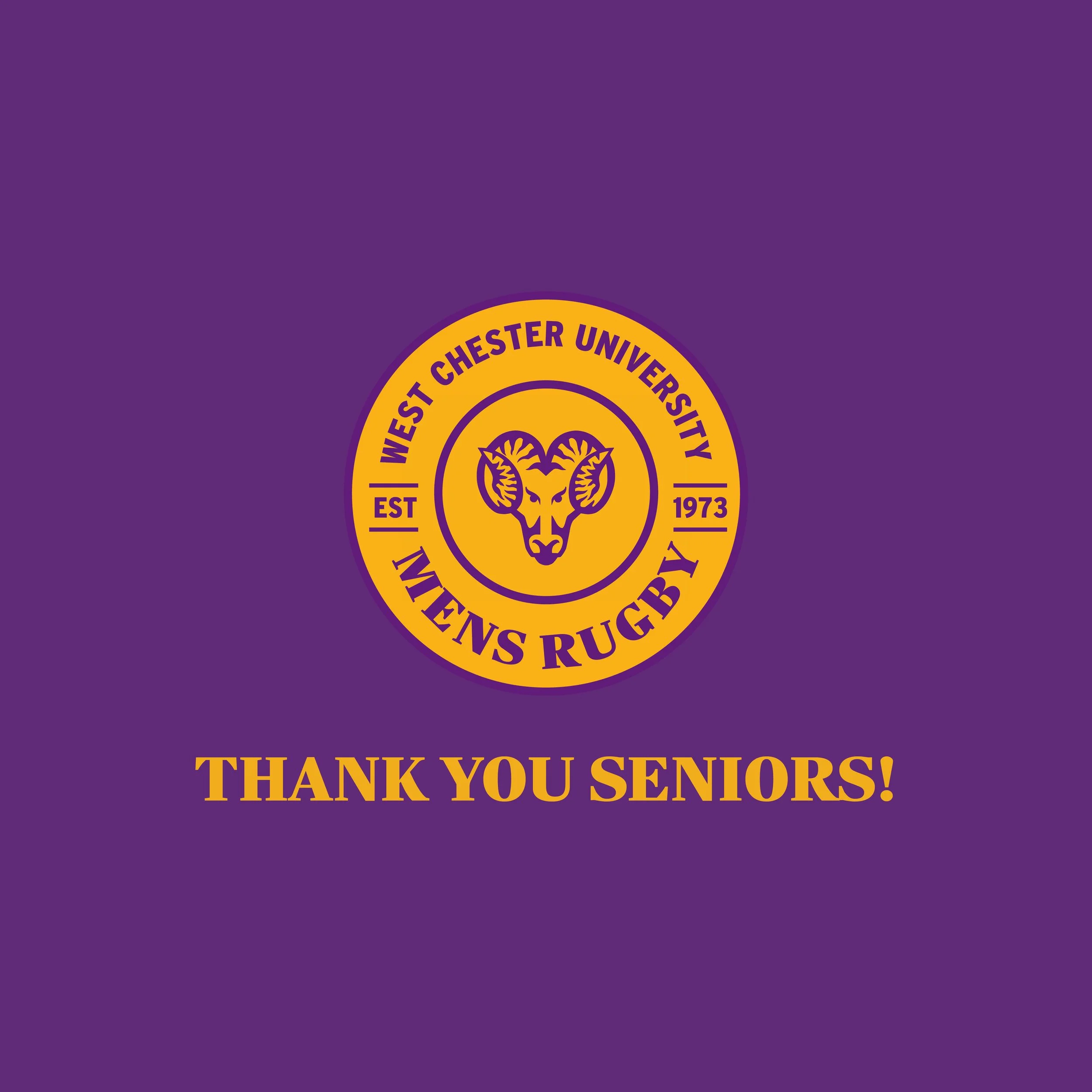
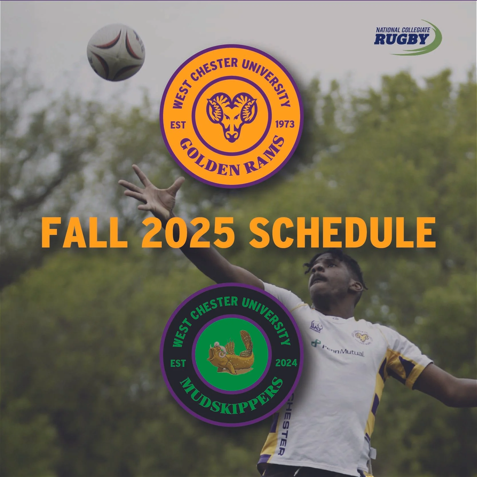
The WCU Men’s Rugby logo and brand identity were created to reflect the team’s strength, unity, and competitive spirit. The design combines West Chester University’s signature colors with bold, dynamic elements that capture the intensity of the sport. The logo emphasizes motion and determination, giving the team a recognizable mark that stands out across uniforms, social media, and promotional materials. The overall brand aims to build pride, strengthen team presence, and create a cohesive visual identity that represents the program both on and off the field.


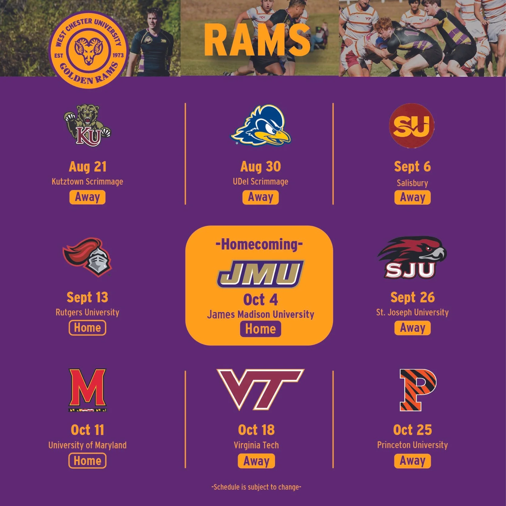
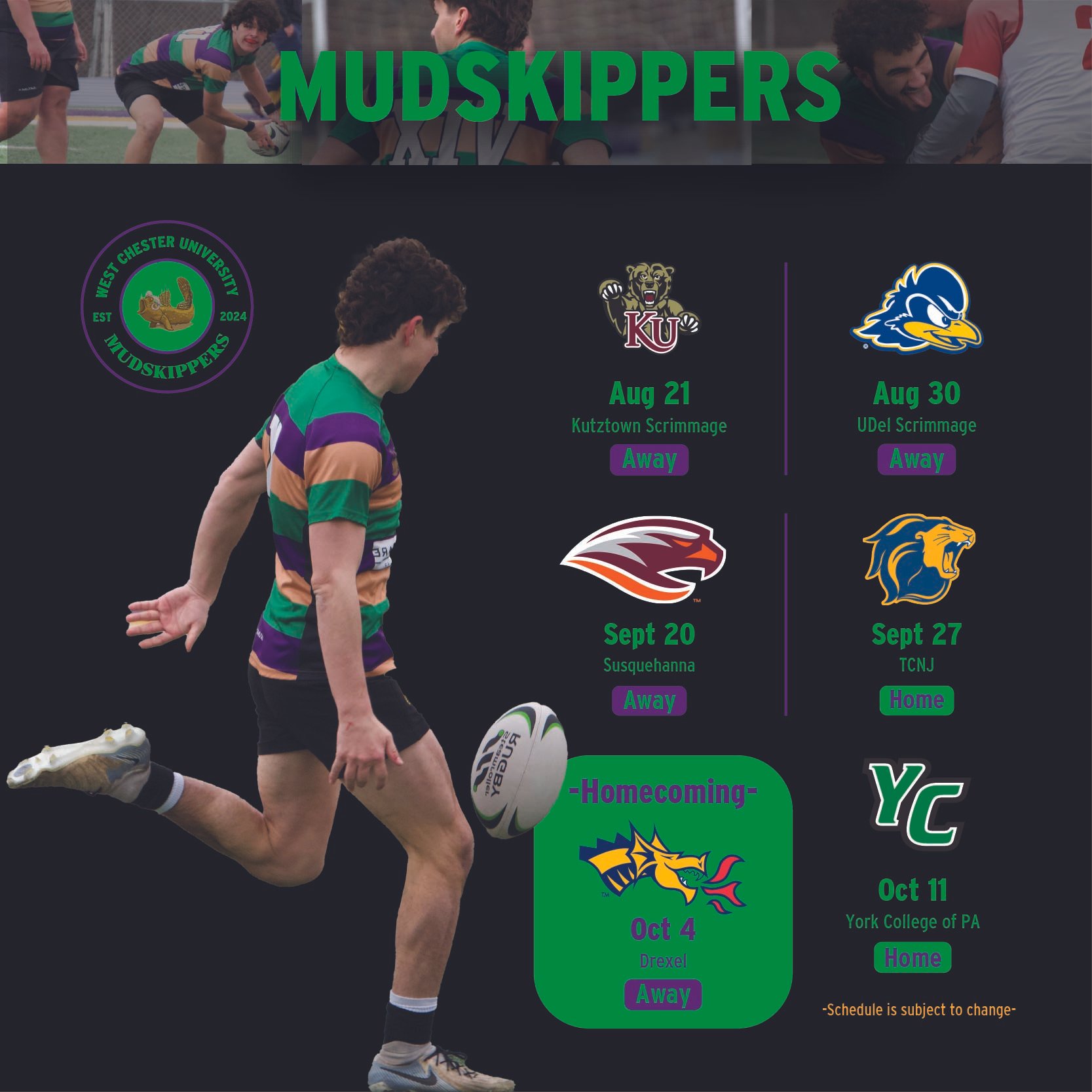

2026 Spring Schedule
Introduced motion graphics to the social media account for the first time, utilizing dynamic visuals and enhanced imagery to create more engaging content and increase audience interaction across the platform.
Key tools
Adobe Illustrator
Adobe Indesign
Adobe Photoshop
Aftereffects
Highlighted skills
Logo design
Typography
Visual storytelling
Motion graphics
Main goal
Reinforce strong brand standards through bold and bright colors